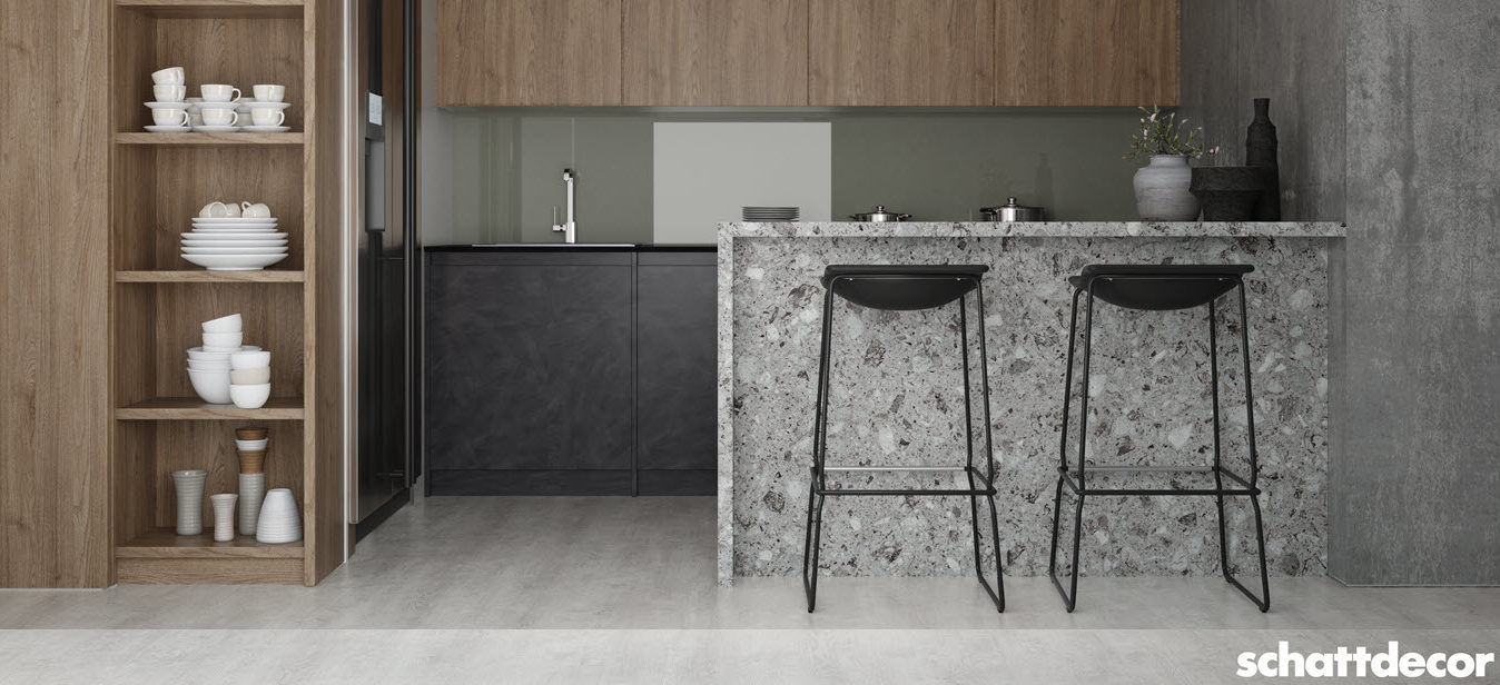
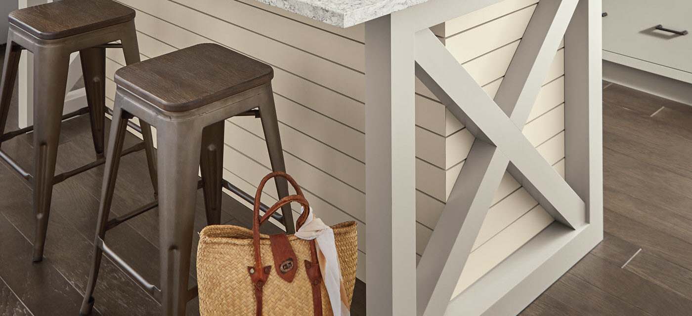
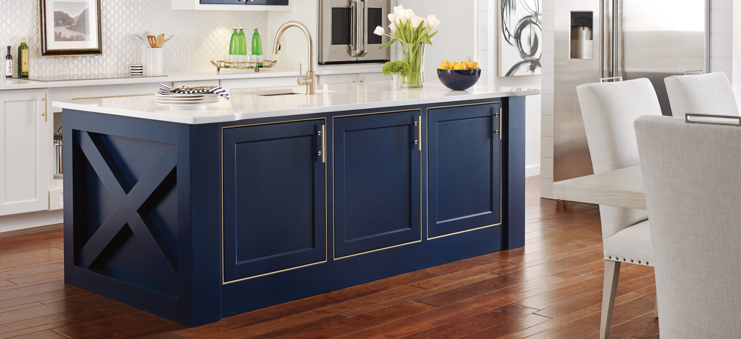
When it comes to collecting a color palette for the home, complementary finishes are key. Decora Cabinetry has released two new multi-dimensional stains along with three new paint colors and a standard stain, all designed to build a complementary and neutral palette of whites or greiges with the added excitement of color pops in trendy cabinet finishes in blues and greens.
The first new stain is called Craggy Peak, a richly dark gray with brown undertones that borders the edge between the two color palettes with beautiful precision.
Multi-Dimensional Stains
The two new multidimensional stains, Iron Slate and Swift, are semi-transparent, allowing the natural wood tones to subtly influence the warm gray or latte colored stains applied to species like Alder, Cherry, Oak and Walnut. There is a very unique aspect to the color build of these particular stains. There is an intentional transparency to encourage overall color influence of gray or brown, and an intentional freeing of the natural movement and texture gained through visible grain like only real wood provides.
In an age of manufactured design with the intent to look natural, there is a refreshing appeal associated with drawing out authentic natural characteristics and allowing mother nature to take the lead on the arrangement of color tones and depth added to a space. Additionally, we not only set the color contribution to enhance the real wood underneath, but also layered subtle tones on top of them to help emphasize the graining.
These cabinet finishes provide an alternative use of popular color trends by introducing a more natural overall aesthetic. The stains work well alongside other colors because of the variation in the complexity of the colors, making them a versatile choice for many design styles.
New Paint Colors
We also don’t want you to miss out on three exciting and extremely usable new paint colors.
The intentionally dusty blue of Grays Harbor can create a cozy scene or, the bright freshness of Fleeting Green and Brightest White which infuse light into any space. These are colors that can confidently be used in current home décor trends.
However your preference sways, cozy or bright, a personalized look can easily be achieved when finishes possess such usability even in their complex color build. Brightest White is intended to be just that, one of the brightest whites in the market, free of undertones and color influences which makes it pair perfectly with any adjacent color.
Fleeting Green is just the slightest hint of a cheerful green infusion into a primarily white base, allowing the impression of color without having to make a bold statement.
All of these considerations are purposeful with the intent to build color confidence for stretching the boundaries in cabinetry palettes beyond the basic white kitchen and infuse the space with depth and inspiration that provides flexibility and longevity.


